Wednesday, November 30, 2011

Photoshop Wishlist #2


  1. When I apply noise reduction in Photoshop — no matter what technique I use — the apparent saturation decreases. Why is this? How can this be avoided? I don’t want to merely add saturation back in, but avoid it. I’ve noticed the same thing with small-sensor digital cameras, those that do lots of noise reduction in-camera.
  2. Are there any good techniques to get rid of the brightly colored noise found along edges? This is due to demosaicing the Bayer array of the sensor. Eliminating this noise usually leads to desaturation of the good pixels.
  3. Photoshop does not resize images well, and often generates interference patterns. Lots of research has been done on these kinds of algorithms, and it would be good to see these better solutions in Photoshop. Also, fractal resizing has many benefits and would be valuable to have also.
  4. I’d like to be able to fully edit ICC profiles in Photoshop. For example, I have a profile that uses the GRACoL ink colors, but has other parameters I’d like to change. The Custom CMYK interface is rather lacking.
  5. When you use curves in RGB, you can either do it with the Normal blending mode, which typically causes an increase in saturation, or you can do it with Luminosity blending, which decreases saturation. How about a simple method which does neither? I just want the tonality to change, not the basic coloration. Click here to see how it is done.
  6. A solid method of adding local contrast. ‘HDR toning’ does this a bit, and a lot of other things at the same time too, making it less useful. ‘Clarity’ is pretty good, but tends to produce halos also. There are better methods.
  7. A ‘Vibrance’ tool for CMYK. This increases saturation without causing any channel to blow or plug.
  8. I’ve noticed that there is a distinction between chroma, colorfulness, and saturation; not really sure how or what Photoshop does. A solid colorimetric model would be useful.
  9. More color spaces. XYZ and xyY would be useful.
  10. Using Munsell colors in the color picker would be great, as well as better out-of-gamut warnings.
  11. Better statistical color tools. Something that can show all the colors in an image as a three-dimensional solid would be great.
Yeah, I know. All of this development is expensive, and it is easy to criticize!

Monday, November 28, 2011

Using ICC Profiles for Creative Color Control

Notice: the ICC profiles I link to in this article are now accessible again.


COLOR MANAGEMENT has become far easier since the introduction of standard ICC profiles, developed by the International Color Consortium, a group of various computer, digital camera, and imaging companies. ICC profiles describe the color handing characteristics of cameras, scanners, printers, and computer monitors, as well as allowing for uniform methods of converting the colors from one device to another. For example, ICC profiles are used to convert the colors captured by a camera to those colors available on a printer.

ICC profiles define a mapping from the typically limited color spaces of devices into a universal color space (which can describe all colors), such as CIELAB or CIEXYZ; from these universal spaces, the colors can then be mapped to an output device. As such, ICC profiles recognize limits of what is possible with any given device, and allows us to compare the capabilities of one device with another. If an output device, like a computer display or digital printer, cannot show particular colors, then the software will use the ICC profile to change the colors to the closest ones available (this will often cause the image to lose detail or saturation).

ICC profiles are also stored in image files, thereby interpreting the colors of the file, and these profiles are used during image editing. Typically, JPEG image files delivered by cameras are encoded into standard color spaces which are independent of the particular make and model of camera. The most common color spaces are sRGB and AdobeRGB; these provide a wide enough gamut of color for practical use, while being compact enough to produce reasonably small file sizes. ICC calls these "three component color encoding" standards. Using these standards are convenient because we can use JPEG or TIFF images from a wide variety of cameras without worrying about the specific characteristics of each. For example, an sRGB color value of (255, 0, 0) will describe the same bright red color, no matter where the image came from.  Some software, including web browsers, actually assume that all image files are encoded in the sRGB standard.

Click here for an overview of RGB color spaces.


I did not create this image. Click here for source and attribution. This shows the relative color gamuts of various RGB color profiles, as well as the color gamut of the Epson 2200 printer.

Each of the standard RGB ICC profiles defines three primary colors: particular shades of red, green, and blue. A narrow standard such as sRGB can describe about 35% of all colors, and so will have primary colors that aren't quite as bright, colorful, or saturated as the Wide Gamut RGB standard, which can describe about 77.6% of all colors. The ProPhoto standard is even bigger and has mathematical primaries that aren't even real colors.  However, be aware that most computer monitors and digital printers cannot display or print color much beyond the sRGB standard, and so sRGB is generally recommended for most uses on the Internet and for consumer-grade printing.

So ICC profiles have these uses:
  • Describing the color capability of a device.
  • A standard method of converting the colors from one device to another.
  • Describing the colors in an image file such as a digital photograph.
  • A widely accepted color standard for cross-platform image interchange.
May I also propose another use of ICC profiles?
  • Creative use. Artists can use ICC profiles to precisely manipulate and control the gamut of color in images.
In his book Professional Photoshop (5th Edition), Dan Margulis described the use of 'false profiles': using ICC profiles as an alternative method of image manipulation. He used this method to greatly brighten shadow detail without modifying the color: this is difficult to do with the standard Photoshop tools.

"photographs very rarely turn out good likenesses"

The first thing that caught my attention was a portrait of mother that hung over the writing table; a photograph in a magnificent carved frame of rare wood, obviously taken abroad and judging from its size a very expensive one. I had never heard of this portrait and knew nothing of it before, and what struck me most of all was the likeness which was remarkable in a photograph, the spiritual truth of it, so to say ; in fact it looked more like a real portrait by the hand of an artist than a mere mechanical print. When I went in I could not help stopping before it at once.

"Isn't it, isn't it?" Versilov repeated behind me, meaning, "Isn't it like?" I glanced at him and was struck by the expression of his face. He was rather pale, but there was a glowing and intense look in his eyes which seemed shining with happiness and strength. I had never seen such an expression on his face.

"I did not know that you loved mother so much !" I blurted out, suddenly delighted.

He smiled blissfully, though in his smile there was a suggestion of something like a martyr's anguish, or rather something humane and lofty ... I don't know how to express it; but highly developed people, I fancy, can never have triumphantly and complacently happy faces. He did not answer, but taking the portrait from the rings with both hands brought it close to him, kissed it, and gently hung it back on the wall.

"Observe," he said; "photographs very rarely turn out good likenesses, and that one can easily understand: the originals, that is all of us, are very rarely like ourselves. Only on rare occasions does a man's face express his leading quality, his most characteristic thought. The artist studies the face and divines its characteristic meaning, though at the actual moment when he's painting, it may not be in the face at all. Photography takes a man as he is, and it is extremely possible that at moments Napoleon would have turned out stupid, and Bismarck tender. Here, in this portrait, by good luck the sun caught Sonia in her characteristic moment of modest gentle love and rather wild shrinking chastity….
—from A Raw Youth, by Fyodor Dostoevsky (1821-1881), translated by Constance Garnett

Monday, November 14, 2011

Additive versus Subtractive Color

Visually-uniform color wheelTHE COLOR WHEEL is a basic tool for representing the relationship between colors. It is basic in that it only attempts to show the relationship between particular hues, and it is a tool only insofar as it is useful and not misleading. But we must recognize its limitations.

This wheel is only valid for the sRGB color space, since it explicitly uses the primary colors of that space; it may or may not be useful for other color spaces. Also, be aware that since this color space uses only three primary colors, it won’t be able to portray the entire color gamut of human vision. The wheel illustrates the principles of additive color, where we mix together various colors of light to get other colors; additive color works well enough with back-lit computer monitors and televisions, and also digital projectors. But this wheel is definitely not valid for mixing paints, watercolors, or other materials with color. It only works with light.

Additive mixing is conceptually simple

Mixing colors with light is an unusually pure and simple process that follows relatively basic mathematical laws. A computer scientist or programmer, or a digital photographer, not experienced with the manifold nuances of paints and pigments, can get a good representation of the world’s color with relatively little effort. But not so with the artist who works in oil paint: color mixing is a far more complex phenomenon.

Digital photography uses additive color — each phosphor on the computer monitor adds together with its companion phosphors to create a particular color. Adding together colored lights gives us brighter resulting colors. This addition is implicit in the color wheel above: with red, green, and blue as our primaries, mixing them together gives us our bright secondary colors of cyan, magenta, and yellow. If, for whatever reason, you had a computer monitor with primary colors made up of the cyan, magenta, and yellow phosphors of the wheel, you’d get a secondary colors which would be brighter and also less saturated: the secondary color made by mixing yellow and magenta would be a bright pink, and not red. But if we were to change the set of phosphors used in a monitor, we still should be able to accurately (and fairly easily) predict how our colors would mix.

Subtractive mixing

Paint is far more complicated. Light falls on paint, and some of it is absorbed (usually turning it into heat) while some of it is reflected, which leads to the color that we see. Leaves are green because their chlorophyl reflects green light — and they absorb much red and more blue light. So real-world objects subtract out some of the light falling on them, reflecting back colored light. Computer monitors have three, fixed colors which mix together, while real-world pigments reflect or absorb colors throughout the spectrum: this makes the subtractive colors of the painter much more complex.

For this reason, exceptionally pure and saturated paints are necessarily going to be rather dark: if a paint reflects only the far end of the color spectrum, near violet, then by necessity it will reflect only a tiny fraction of the total light falling on it. Fluorescence helps here, because normally invisible ultraviolet light is shifted in frequency to visible light — but this only works if the radiation falling on our paint has ultraviolet in it.

The colors should look the same...

Digital cameras have precisely three different kinds of color sensors, and the typical human eye also has three kinds of color receptors (plus another more noticeably used in low light). A camera and the eye collapses a broad range of hundreds of distinguishable light frequencies to merely three stimuli or numbers. But consider what this implies: various colored objects may absorb and reflect all sorts of differing frequencies of light, but they all may appear to be the same color to the human eye under a given lighting condition. To complicate matters, digital cameras and human eyes don’t have matching color sensitivity: they are fairly close within the range used in photography, and under good lighting conditions such as daylight or bright incandescent, but they don’t match for all colors or under all lighting conditions. They most certainly won’t match under poor quality light, such as found with plasma discharge lamps (including fluorescent lamps) and LED lighting.

Therefore you cannot say that mixing a yellow paint and blue paint — even if they appear to perfectly match the colors on our color wheel — will give you a gray mixture. You need to know which yellow, and which blue paint are used. After all, a wide variety of reflectances will give you same yellow or blue color. You cannot use a color wheel like the one above to predict the outcome of mixing paint.

A good theory of subtractive color mixing?

If we could measure the reflectance of each pigment, and measure the spectrum of light falling on the pigments, then we could predict, with much bother and mathematics, what the resulting color mixture would look like, although still we would have to take into account whether the paint is wet or dry, or what kind of brushes and brushstrokes were used, plus the opacity of the paint, plus the thickness of the paint, plus the texture and color of the canvas or board or paper on which the paint is applied.

With additive color we can reliably produce white, black, and shades of gray by mixing together all three of our primary RGB colors in equal quantities. White, of course, can’t be mixed by any combination of colored paints, nor can we reliably get pure black by mixing together a few colors. The color of the canvas or backing, as well as the opacity of the paint, will limit the brightest and darkest colors that can be produced. As it so happens, the white and black paints used by artists does not evenly reflect or absorb light uniformly, making the process of creating tints or shades not completely straightforward — mixing a color with black may cause the color to shift towards warmer or cooler tones if not done carefully.

The solution, the difficult, laborious solution to subtractive color mixing is experience, or otherwise having access to sample swatches — a very large number, thousands, of color mixes — although experience is definitely needed if you want to do good work.

Minimal palettes of colors

A good, comprehensive, predictive theory of subtractive color mixing is complicated to the extreme, far more complicated than the already complicated theory of additive color mixing. To reduce complexity, in photography, we limit ourselves to three primary colors, knowing that not all the colors visible to the human eye can be represented in their full glory, and knowing that we accept these limitations in order to practice our art. In the realm of painting, artists (especially beginning artists, or those painting in oil in plein air) often limit themselves to six or so colors, plus one or two kinds of black paint, and one or two kinds of white paint.

The idea of three primary colors works well with additive color, but even though it is limited, it is still used almost universally in digital photography: plus we have the advantage of being able to use mathematical primaries that are out of the range of human vision, expanding the gamut of colors we are able to accurately represent. But the use of three primary colors in painting is disastrous; following this misguided theory could cause an artist to severely limit his palette unnecessarily — although, if that is his artistic intent, that’s fine, it just isn’t a good theory of color. And so, a painter must select a set of paints, and typically this set is more than three colors. If the color of any given paint cannot be mixed with the other paints in the set, then that is a primary color. An artist may use additional colors, such as burnt sienna, which are located within the chosen gamut, but using these is largely a convenience and not necessity.

Three numbers suffice to describe any given color of light or pigment under controlled conditions. But three colors are never sufficient to make up a complete system of colors.

Sadly, most commercial and much digital printing technology uses only three primary colors — cyan, magenta, and yellow — plus black, which gives us a limited gamut of possible color, and which is highly dependent on the whiteness of the printing paper used. While adequate, painters can do far better by adding other colors which cannot be mixed by these primaries. Typically speaking, a gamut made of six bright, saturated colors is adequate for creating a minimal palette, with the colors being fairly visually equidistant to each other, along with black and white. An older split-palette theory of color mixing used three pairs of primary colors, with one of each pair mixing cool and the other which mixed warm. Oddly enough, even though the split palette is somewhat deprecated in painting, a form of this is used in high-end digital printers: pastel primary colors are used to get better color in highlights, and only a few digital printers use good red, greens and blue inks which are otherwise not mixable.

While painters may envy the purity and simplicity of color mixing available to photographers, they must not assume that the overly simplistic tools of the photographer — like the digital color wheel — apply to their art. Likewise, photographers may have a certain smugness over their control of color, but instead they ought to be humbled by the skill required by the artist when mixing colors, as well as the range of the artist’s palette, which far exceeds that found in digital printers.

Friday, October 14, 2011

Color Spaces, Part 3: HSB and HSL

IGNORE THIS ARTICLE: the information presented here is problematic, difficult to apply in Photoshop, is error prone, and obsolete. Do not read any farther. This information is of no importance to photographers.


OK, not really. This article is about color systems that ought to be useful, that ought to be implemented — somehow — in Photoshop, but they still have plenty of traps for the unwary.

Artists, unlike those who have an affinity for mathematics, may find the RGB color system a pain. They perhaps object to the idea of reducing such a subjective concept as color to mere numbers, or perhaps they object to the unintuitive process of mixing the colors together in RGB. Photoshop is such a pain. It must have been invented by nerds.

For example, the RGB color for a particular tone of orange is R=180, G=95, B=6. But this is ridiculous; orange, a mixture of red and green? And with some blue thrown in also? No, that's wrong. Orange is a mixture of red and yellow, and there ain't no blue it it at all: but for sure that dim tone of orange has some black in it. And what's with these RGB values going from 0 to 255??? That number 255 makes no sense at all. Now, if we have to use numbers (and why can't we use good names for colors instead?), then why not use something more understandable like 0% to 100%?

Also, it seems that some particularly pure colors are missing from RGB. Tyrian purple, intense electric cyan colors, and rich, deep tones are nowhere to be found.

A painter would rather describe color in ways other than RGB.  Here are some artists' color terms:

Hue is the basic quality of a color: is the color basically red, orange, yellow, chartreuse, green, aqua, blue, violet, or magenta? These hues are arranged in a circle around a color wheel, which shows how these colors relate to each other, and also how new colors can be obtained by mixing other colors. Now there is some controversy as to what precise set of colors ought to be used to obtain a minimal palette: some say that the three primary colors (red, yellow, and blue) is the minimum number of colors for a basic full-color palette; although white, black, or both are sometimes added to the mix, depending on whether the artist is using paint or watercolor. Other artists say that six colors (plus black and/or white) reproduces nearly the full range of color. Since these colors can mix together to produce nearly all known colors, any extra colors in the palette are simply a convenience to the artist; they aren't strictly needed. But no matter what color system is used, mixing together adjacent colors on the color wheel will produce novel colors, while mixing opposite colors together will give a grayish, blackish, or muddy tone.

Tints are pastel colors, made by mixing a color with white.

Shades are dark colors, made by mixing a color with black.

Brightness, value, or intensity tells us how close a color is in luminous quality to either white or black, or how bright a color is compared to the brightest available version of that color. Aqua is a brighter version of teal. Azure, dark midnight blue, and Dodger blue are basically only different in brightness.

Tones are colors that are mixed with both black and white (or gray) paint. These colors are muted, toned-down versions of the base colors.

Saturation, chroma, or colorfulness is how pure a particular color is. Tones, shades, and tints are less saturated than pure hues. Slate gray is less saturated than azure. Carmine is more saturated than copper rose, even though they are approximately the same hue and brightness.

Other qualities include transparency, fluorescence, glossiness, and so forth,


Tuesday, October 11, 2011

Deblurring


This is a technology preview of Photoshop software that can remove motion blur from an image.

Friday, October 7, 2011

A Visually-Uniform Digital Color Wheel

A WHILE BACK I published a color wheel, made according to the digital sRGB color standard. This standard color space is used with most digital cameras, and is the standard used by the Web and high-definition television. You can see this wheel by clicking here. But this wheel is wrong: rather, I present a new color wheel which is more visually uniform:

Visually-uniform color wheel

Most artist's color wheels, as found in art stores and Internet searches are quite misleading. The idea of a color wheel is to show the relationship between the colors. Of great importance is the idea of color opponency: if you mix two colors opposite from each other on the wheel, you will not get a third color, but rather gray. But these color wheels do not work for digital technology. Red, yellow, and blue — the primary colors typically used in these wheels — are not the primary colors used in digital photography.

But like the artist's color wheels, my old color wheel is also misleading:

bad


The primary and secondary color relationships shown here are correct. The primary colors of red, green, and blue are opposed to the secondary colors of cyan, magenta, and yellow, and if you mix these opposed colors in Photoshop you will indeed get a neutral gray. But the tertiary colors look wrong. Orange appears to be closer in brightness to red, being much darker than yellow, and likewise sky blue looks darker than it ought to be. There is hardly any differentiation between the green colors.

We are looking for the brightest colors we can as our primaries.  Setting R=255, with G and B both equal to 0, we will get the brightest and most saturated pure red that can be represented by the sRGB color system. The opponent color to red is cyan, which we get by setting R=0 and G and B both equal to 255, and this is the brightest and most saturated cyan we can represent in our system. When we mix these colors together, we get a neutral gray color. By default, Photoshop will average all these colors together to gray. As it so happens, the average color number ought to be 127.5, but since fractions are not possible when using Photoshop in 8-bit mode, we get either 127 or 128; but this is close enough.

Click here for an overview of the RGB color system.

The tertiary colors are halfway between adjacent primary and secondary colors. So the tertiary color between red and yellow will be orange. Our red value is equal to (255, 0, 0), while our yellow value is (255, 255, 0). Averaging these numbers together, I get a middle orange tone of (255, 127.5, 0). Rounding the green value up to 128 (since we can't use fractions), I get the orange tone shown in the old color wheel above. But it is too dark, too close to red in tonality than to yellow. The color appears to be correct, but not its brightness. So I set about manually trying to come up with a color that appeared to my eye to be halfway between red and yellow. Using a number of ad hoc methods to blend colors in Photoshop, I attempted to produce a visually continuous range of tones between each primary and secondary color. As it so happens, I found that the new tertiary colors were always brighter than my original estimates, in fact, the middle RGB value for these tertiaries were quite close to each other: I estimated that they all were around 180-190. Now this meant that the tertiary values across from each other on my color wheel were no longer opponents. Mixing my new orange with my new sky blue got me a somewhat dim and unsaturated green color. But I was willing to accept this shortcoming in order to portray my tertiary colors with visual uniformity.

My mistake was assuming that the mathematically intermediate value of 128 was also visually intermediate. This is wrong; I did not account for gamma correction. The human eye sees light in such a way that doubling the intensity of light only makes a scene to appear a bit brighter. Likewise, cutting the intensity of light by half makes the scene appear to be only a bit darker. Our eyes can operate under an extreme range in lighting due to this property. The practice of gamma correction adjusts the color tones in the RGB system so that the range of brightness is more visually uniform: otherwise, most of our RGB numbers would represent only the very brightest of colors and would neglect darker shades; our coding would be inefficient.

Now gamma correction requires more than simple arithmetic, and the sRGB standard uses a non-standard, non-uniform gamma correction to the RGB data, making this whole process murky. I'll spare you the details; instead, read the article linked above. What is important is that gamma correction does not change the values of 0 and 255 in 8-bit RGB color, it only modifies intermediate values, and so our calculations with our primary and secondary colors are unchanged. Only the tertiary colors will change with gamma correction. Intermediate values, after backing out the gamma correction of sRGB, become 187.5, and so in the color wheel above, I set the values to either 188 or 187.

This still leaves us the problem of mixing colors in Photoshop. Blending together opposite tertiary colors does not give us a neutral gray.  However, this has already been thought of. If you go to Edit-Color Settings, and then click More Options, we get this:

Color Settings

Select Blend RGB Colors Using Gamma 1.00, and the color mixing will be correct. This option subtracts out the gamma correction, allowing more accurate color blending. If we blend together our leaf green and our purple, under a gamma of 1, we will get a neutral gray color, and it will be the same shade of gray that we get if we blend together any of the opposing colors on the wheel. Since I'm not all that sure what other effects this option may have, it probably shouldn't be set at all times. But we do see that it in fact does produce more visually accurate color blends.

How does the wheel look? One problem is that the sRGB color gamut exceeds the capability of my calibrated iMac monitor, and so most of the colors here cannot be presented to my eye in their full glory. I find that I can hardly distinguish rose from magenta — how about you?

Thursday, October 6, 2011

The Academy on LED Lighting Technology

BETWEEN 2% AND 10% of a motion picture's budget is for lighting, and if we consider that much of that cost is for electricity and for the purchase of low-life expectancy lamps, then new technologies look quite promising. Solid state light emitting diode (LED) lamps produce great amounts of light at low power consumption, they don't generate much heat, they have a long life, they are lightweight, and they are tough, making them unbreakable and safe to work around. The new solid state lighting has many benefits, and the United States government is heavily encouraging its use.

The Academy of Motion Picture Arts and Sciences is studying the new LED lamps for suitability in motion pictures. Their preliminary research can be found at the Solid State Lighting Project page.

The results are not good. LED lamps do not present colors very well to the camera.

Generally speaking, according the presentation linked above, LED lighting is currently a poor choice for getting good color, most particularly for getting good skin tones, which are particularly harmed. The example tests show skin looking more green and sickly instead of having a healthy ruddy glow. The tests show also that makeup looks inconsistent under LED lighting, and does not blend as well with bare skin. Tans, light browns, and reds tend to be harmed significantly, while some blues are enhanced. Colors in general appear to be less differentiated under LED lighting, and complex fabrics tend to 'flatten' and have less pronounced shading and texture. The use of these lights could impose greater costs, requiring color checks before filming.

Tungsten lamps and daylight produce a flat, uniform spectrum, and so are perfect at rendering colors accurately. Film stock and digital sensors render the colors from this kind of lighting very well.

In the Academy's opinion, the discontinuous spectra produced by LED lighting is problematic. The terms 'color temperature' and 'color rendering index' are not particularly useful when discussing LEDs, because of their discontinuous color quality. A solution, they think, may not be in improving the LED lamps themselves, but rather in developing custom film stock and digital sensors that better match the LED spectra. They also think that custom discontinuous filters could be used, but this will remove much of the electrical efficiency of the lamps, making their use largely moot. These fixes are not likely to help photographers who are much less in control of their lighting, and who need more general-purpose equipment — an LED optimized sensor would do a rather poor job under daylight.

Visually, the various light sources look the same to the human eye: but the camera does not perceive light the same way and colors are rather unpredictable. I ought to note that much research is currently being done to make a visually balanced LED spectrum, but this by no means is expected to work well with photography. Every model of sensor will have a different response to the LED lighting, making color matching more difficult.

The Academy thinks that LED lighting products are being rushed to market without taking into concern the needs of quality color reproduction. They also see the need to have quality third-party evaluation of the products emphasizing cinematography.

Saturday, October 1, 2011

Autochrome

THE LUMIÈRE BROTHERS, Auguste Marie and Louis Nicolas, are known for being pioneers in motion pictures, having patented the cinématographe in 1895, and by holding the first commercial movie screening that year. However, they thought that “the cinema is an invention without any future,” and instead they concentrated their work on developing color photography. While photographers did produce color images by taking a series of black-and-white exposures from behind various colored filters, the Lumières (their name, appropriately, is French for ‘light’) developed a method of making a color image from a single exposure. Their plates could be easily developed with standard darkroom methods and chemicals and required no unusual equipment to view.

Autochrome plates had a layer of starch grains, dyed to three primary colors. These tiny grains acted as color filters during both exposure and when viewing. The plate used standard silver chemistry, and was developed so as to remove the silver that was exposed to the light — which is the reverse of the normal process. The completed plate then had a positive color image when viewed with a back light.

Autochrome Lumière plates were first marketed in 1907, at a cost a number of times more than standard black and white plates. This proved to be the most practical color photography method until the 1930s.

Children in medieval costume
Children in Medieval Costume, by Mrs. Benjamin F. Russell, ca. 1910. George Eastman Collection.

Autochrome was used to create slides, viewed either by a slide projector, or through a hand-held viewer. It is said that printed reproductions of Autochromes — especially those made during the era when the process was used — do not do justice to the medium; the original colors are delicate, with excellent color separation and balance. But autochromes are sensitive to light, heat, and oxygen, with surviving images often being in poor condition.

While there are many differences between Autochrome and newer color photography methods, the most striking difference is that Autochrome used orange, green, and violet dyes as the primary colors of its palette, in contrast to the now-standard red, green, and blue primary colors. This inevitably and severely limits the range of colors that can be represented by this method.

But muted colors are not necessarily a bad thing. Autochrome remained popular until the 1950s, especially in France, because it produced more subtle color than newer films. The American film Kodachrome (produced from 1935 to 2009) was known for producing excessively bright color, while the Japanese Fujichrome Velvia (introduced in 1990) produces colors very often criticized as garish. The contemporary digital photography color standard also produces colors which can be excessively saturated. Can an understated, limited, and muted use of color be sometimes superior?

As it so happens, the range of colors produced by Autochrome ought to be accurately reproducible by modern digital cameras, since their native color gamut is so large. Intrigued by Autochrome, I set about devising a method of reproducing its color range. Here are some experimental digital photos, limited to use only my estimate of Autochrome's color palette:

Lemp grain elevators

Autochromed yellow flowers

Autochromed stained glass window of Saint Francis Xavier, at the White House Retreat, in Oakville, Missouri, USA

Pink flowers

Unusual sky color illumines buildings in the Soulard neighborhood in Saint Louis, Missoui, USA

Pere Marquette State Park, near Grafton, Illinois, USA - panorama of indian mound

Saint Francis de Sales Oratory, in Saint Louis, Missouri, USA - Palm Sunday procession

Missouri Botanical Garden (Shaw's Garden), in Saint Louis, Missouri, USA - lily

Autochromed buildings in Clayton, Missouri, USA

I reduced the color gamut of these photos to my estimates of the primary colors used by Autochrome. As these primary colors are more limited than the sRGB primaries, we ought to be able to reproduce them more or less faithfully here. There are plenty of Autochrome images on the Internet, but many of them are scans from printed images, which will throw the colors off. I attempted to find only direct digital images of Autochrome slides, and used those to estimate the primary colors. Clearly there is lots of variation among my sample photos, not the least of which is changes in exposure and white balance, as well as the color response of the various digital cameras or scanners. But I did the best that I could. Here is the process I used:
  • I collected dozens of Autochrome images from the Internet, and put them together into a large photomosaic.
  • Using selection and threshold tools in Photoshop, I eliminated colors that were not saturated, changing these to a uniform neutral gray.
  • Using Indexed Color, I was able to reduce the color palette gradually until I was left with several clusters of colors, which corresponded to the three Autochrome primary colors, three secondary colors, and black and white.
  • From the sample colors found in the Color Table, I picked out the brightest, most saturated typical-looking colors from each cluster as the primaries.
  • Using a color conversion tool (ColorSync can do this), I determined the Yxy color values associated with the RGB numbers found in the Color Table.
  • I created an Autochrome ICC profile in Photoshop using these Yxy values.
  • Converting an sRGB image to the Autochrome profile may or may not make a big difference, depending on the brightness of the colors found in the original images. However, you can edit the image considerably to bring out the colors better, and never leave the Autochrome gamut.
  • I have no way of knowing if I got the colors right, and there obviously is a lot more work that can be done with this, but this limited palette still has a certain beauty and opportunity.
My processing may mimic somewhat the color produced by Autochrome, but these examples do not show the distinctive pointillist-like colored grain found in that medium.

Some Frenchmen, using original Lumière equipment and notes, are attempting to duplicate the process in its full glory. While not likely to become widely used, this is still a worthy medium for color photography.

UPDATE: see the article Using ICC Profiles for Creative Color Control for specific instructions on converting images to the estimated Autochrome color gamut. For the photographs in this article, I used the Old Autochrome ICC profile. I’ve made an attempt at simulating the grain and dark tones of Autochrome. See the article An Imitation of the Autochrome Lumière Process.

Thursday, September 15, 2011

White Balance, Part 2: The Gray World Assumption and the Retinex Theory

WHITE BALANCE is one of the most important functions of digital color photography. Understanding a little bit of theory about this function could improve your photography.

Very many beginning photographers (and I was certainly one of them) are quite disappointed with the quality of their images. Although they may find it hard to put into words just what precisely is wrong with their images, bad color or a color cast may be a significant problem. When I learned about white balance and how to correct for it, I immediately thought that my photos looked much better.


Bad versus better white balance, among other things. Saint Vincent de Paul Chapel, in Shrewsbury, Missouri.

Clearly, the color of light is often variable, and the color my camera captures is usually somewhat different from what I see in real life. However, if I am careful to set the white balance, then typically my colors look much better under most circumstances.

There are some principles that we ought to keep in mind:
  • Our eyes do white balancing naturally. This leads to color constancy, where particular shades of color appear to be subjectively similar under a wide variety of objectively different lighting conditions.
  • White balance in photography corrects for extreme changes in the color of light; it is not a slight adjustment.
  • For the best results, we ought to do white balancing early in the photographic process.
  • We cannot rely on the camera or software automatic white balance function to give good results.

Friday, August 19, 2011

Anniversary of the Daguerrotype

ON AUGUST 19th 1839, the government of France released the patent on the Daguerrotype to the world, which made photography commonplace.

The promise of photography had been around for decades: Joseph Nicéphore Niépce had been working on his heliograph process since 1793. His problem was that his photographs quickly faded, and his oldest surviving images date from about 1825 or 1826. Starting in 1829, Niépce partnered with the prominent painter Louis-Jacques-Mandé Daguerre to further develop the heliograph process.

Daguerre and Niépce worked on the physautotype, a process where lavender oil dissolved in alcohol was applied to a silver plate to produce an image. This process required that the plate be exposed in a camera obscura for many hours. After Niépce's death in 1833, Daguerre discovered that exposing a silver plate to iodine vapors before exposure, and then mercury vapor afterwards, could produce a plate far more sensitive to light. Daguerre patented his process in 1839, and then gave his patent to the French government in exchange for a pension for himself and Niépce's heirs.

There was a boom in professional photography. By the 1850s, photography studios could be found in nearly every major city.

Monday, August 1, 2011

1 Bit Depth Cameras

PLEASE EXAMINE these two photos:

Flower-8 bit-reduced

Flower-1 bit-reduced

Not too much difference.  The second photo has perhaps slightly greater contrast, saturation, and sharpness.

Now both these images came from the same RAW file, but had different processing; I reduced these images to this size using Photoshop's Bicubic algorithm.

Now let's zoom far into a small part of the original images:

zoomed

The second image has one bit per color channel!  Each of the red, green, and blue color channels is either fully on or off, and so we have only 8 possible colors per pixel versus millions of possible colors in the top image. But when we reduced the image in size, these pixels were averaged, and so appear normal in the final image. By averaging, we can obtain every possible color in the sRGB gamut.

Lousy, horrible image quality, when we pixel-peep at 100% resolution; but it looks just fine at the resolution shown on the screen.

But we really don't have to do pixel averaging to get a plausible image:

Union Station in Saint Louis - 1 bit depth image

The pixels on this image are black and white only — no shades of gray. This image is interesting, but it has poor image quality; but if we had more and smaller pixels, an image like this would appear to the eye to be a continuous grayscale of high quality.

The notorious megapixel wars of a few years ago had new models of cameras coming out with ever higher pixel densities, at the expense of higher noise. When I got my Nikon D40 back in 2008, I specifically chose that model because it had the best balance between noise and pixel density. Since I was going to produce full-resolution images for the book Catholic St. Louis: A Pictorial History, I needed a minimum number of high-quality pixels for full-page images. Now I could have used a higher pixel density camera, but at that time I had problems with image downsizing, which harms sharpness.

The problem with high megapixel, small sensor cameras is noise; but noise is not a problem if you don't look too closely: and clever image manipulation can make this noise invisible or unobjectionable in the final image. Let's not forget that the single best predictor of image quality is sensor size. You can get a decent small image with a small sensor, but a large sensor will deliver high image quality with both small and large images.

What this little experiment tells us is that we don't need high quality pixels to get a high quality final image, if we have enough pixels.

Suppose some manufacturer could cram 250 megapixels into a typical ASP-C sized sensor as found in consumer grade DSLR cameras. If you zoom into your image at 100% resolution, the image might appear to be only noise, but by clever processing you could produce excellent large images with superb detail.

We can learn a few lessons from old film photography. The crystals of silver halide embedded in film change chemically when exposed to light. Please be aware that light, when examined closely, appears to be made up of little discrete chunks called photons. Whenever a number of photons would hit a piece of silver halide, no matter how large or small a crystal, the crystal would change. And so, large crystals are more sensitive to light than smaller crystals, since roughly the same number of photons would likely change either size crystal. The crystals that absorbed photons would then remain in the negative, and would appear black, while the crystals that did not absorb photons would be washed away during developing, and so only the transparent film remain.

So in a certain sense, digital photography is more analog than film photography, and film is more digital than digital sensors.  A film grain is either on or off, with no intermediate steps, no shades of gray. In developed film there is either a grain at any given part of a negative, or there isn't: it is all black or white. Only when we look at the negative from a distance can we perceive an image.

Film grain has many advantages. Because the grains have random shapes, we do not see aliasing in film images — we don't see digital jaggies or interference patterns. By mixing various sizes of grains, we can expand the dynamic range of film: some grains will be more likely than others to be exposed, and so we can get both good shadow and highlight detail, as well as a gradual fall-off in highlights, instead of an abrupt cutoff in highlights as we see with digital cameras (Some Fuji digital cameras had two sizes of sensors to avoid this a bit). Film grain can also add perceived texture as well as sharpness.

Digital photography, following the long example of film technology, could utilize very large numbers of tiny pixel sensors of varying sizes and shapes, and these sensors would register only on or off signals: they would be 1 bit sensors, just like film grain. Although pixel peeping on such an image would be painful, we should expect to obtain superior final images, with much higher dynamic range, good fall-off on highlights, and nice texture and sharpness without digital artifacts. We also would have better control over digital noise, particularly in the shadows.

One interesting advantage to having super high pixel densities is that camera manufacturers could include sensors of various color sensitivities, greatly expanding the color gamut of the sensor, as well as provide far more accurate color rendition. These extra color sensors could emulate the Purkinje effect, and be able to accurately capture an image that corresponds to how humans see in dim lighting, particularly at dusk. Some sensors could be sensitive to infrared, and others to ultraviolet. We have so many pixels in our camera that it wouldn't be much of a waste to assign a certain number of them for odd uses: it would hardly cause a degradation for most images. Various sizes of pixels could be scattered across the sensor, giving better dynamic range; random shapes and sizes could produce images less prone to aliasing, as well as providing more sharpness.

Sensor design would be challenging, for various trade-offs will need to be made: what would be a good balanced design? Blue sensitivity is poor in the standard Bayer design, and red sensors could be boosted in number also. Why can't we also include a number of panchromatic sensors as well, instead of relying mainly on green for luminance? What percentage of the sensor area should be dedicated to big sensors, how many tiny pixels should be included? Can small pixels be superimposed upon big pixels? If varying shapes of pixels are used, what shapes are best; pointy or round? This design offers great potential. Manufacturers could even incorporate Foveon-style sensors, where multiple colors are sensed at the same location. They could even get very clever, by changing the size of the sensors according to depth.

RAW conversion for such a sensor would be difficult — or rather interesting — and would likely require a much faster on-board computer in the camera. But for a hypothetical 250 megapixel camera, we would have precisely one bit per pixel, and so the RAW file size would be only about 31 megabytes in size before compression: not terribly much larger than what we have today. JPEGs produced by this kind of camera would not be full resolution, but then we don't want full resolution, we need to have some sort of averaging of the pixels. But even a lightly processed TIFF file would produce a superior image; up close, we would perceive something that would look like photographic grain, which is much more organic than digital pixels.

This kind of camera would give us unprecedented control over the RAW conversion process. You want an infrared image? You got it. You want ultraviolet? Easy. You want to trade off color accuracy for dynamic range? You want to bring up detail in both the highlights and shadows? A one-bit depth camera can be very useful.

Thursday, July 7, 2011

Coming Soon

IMAGINE A light source, which can automatically match the color of ambient light.

So many times I've taken interior photos, with the room illuminated by tungsten lighting; however, some light comes through the windows, but that looks strongly blue and so harms the photo. For my best work, I adjust the color of the window lighting and the artificial lighting separately in Photoshop, but this is time-consuming and error-prone. Big-budget cinematographers will put colored gels over the windows to get the light colors to match, or they will put gels over their lights. But the use of gels has the unfortunate side-effect of decreasing the light intensity, requiring even brighter and hotter light sources, much to the dismay of the actors.

Rift Labs is developing a three-color lighting panel which has variable color temperature. Using low-power, three-color light-emitting diodes, their forthcoming light panels will automatically be able to match any lighting situation. Or, any color of light can be dialed-in, and the brightness of the lighting does not change.

So photographers and cinematographers can have a portable, battery-operated, low-cost lighting system which can quickly and conveniently produce the color of lighting needed. A good use of this would likely be for fill-in lighting, an augment to ambient lighting. Portable, battery-operated white-light LED panels have appeared in the last couple of years, causing much excitement, but Rift is taking this to the next level.

The organization is making these lighting units open-source, and provide the circuit diagrams and controller software free of charge; if their concept proves usable, we ought to see many similar designs produced at low cost in the near future.


I noticed that they are having trouble finding the correct method of producing a uniform illuminance under a change of color temperature. This is likely to be problematic for them, since the sensitivity of digital cameras to various color temperature conditions is variable across manufacturers and models of cameras.  See here. They may need to adapt their system to include color calibration data specific to particular kinds of cameras. Likely this will merely require a custom color transfer matrix — nine numbers — that will provide closer mapping between what the camera sees and what the light source delivers. This color matrix could either be encoded as a camera model database in the device firmware, or the user could type in the numbers if they know them. A more clever method could be a built-in algorithm for color calibrating the camera: this little feature could be a strong selling point.

I also wonder about the color quality produced by this kind of unit. Since it uses only three colors — red, green, and blue — it may not operate equally well under all color gamuts used by digital cameras. Please recall that it is impossible to mix all possible colors from only three primary colors.  However, if they concentrate on getting sRGB right, then this unit ought to operate well for 99% of uses. But there will still be metamerism problems: colors that look identical to the human eye will look different to the camera, and this kind of three-color lighting will make metamerism failure even more prominent. They may find they get better performance if they also include some other colors in their LED array to provide a more uniform spectrum.

This kind of lighting could be of great benefit for those who shoot RAW. Digital cameras have a fixed white balance: this raw data is processed to produce images correctly balanced according to the color of the light. However, lots of the RAW data is thrown away during this processing, which leads to increased digital noise, particularly in the red and blue channels. The Rift Labs product can be adjusted to produce a magenta light which will accurately produce an accurate RAW light balance: no data is thrown away, and the noise level is reduced to its practical minimum. This is likely only of interest to specialists, but it does show how useful this device can be.

UPDATE: Click here to read an article on color rendition under LED lamps. You may expect color shifts with using these kinds of products.

Friday, July 1, 2011

Contrast, part 1: Black and White

A FRIEND ASKS, “What is contrast?”

Simply, contrast in photography is what differentiates one thing from another because of differences in tone. A contrasty image will have lots of black and white tones, while a low-contrast image will have lots of medium gray.

The English word ‘contrast’ comes from the Latin contrastare, meaning ‘stand against’, and so in a contrasty image, some elements will strongly stand against others, instead of blending together.

Here is a more-or-less visually uniform grayscale image that I'll be using as the basis for examples:

Grayscale with noise

It goes from black on the left, to white on the right.  I threw in a little bit of noise to illustrate my examples better. I used this contrived image instead of a real photograph in order to more accurately show what is going on. Please don't get too bored with this repetition.

Here is this grayscale's histogram in Photoshop:

Grayscale with noise - histogram

The grayscale illustrate how many pixels are in each range of tone; with black pixels on the far left, and white pixels on the far right. The noise adds lots of jitter to this histogram, but please note that it is otherwise fairly uniform going across; on average, there is just as much black as there is white, and just as much middle gray as either of those.

Photographically, we can use the word contrast in various ways. Global contrast — which is what we are mainly concerned with here — tells us how the total range of tones are divided up in an image; how much strong black and strong white are found in an image?  Since our example image is uniform, we can say this has neutral global contrast.

Here I use the Brightness/Contrast tool in Photoshop:

Grayscale with high contrast

I made this image with this Photoshop setting:

Grayscale with high contrast - histogram

Setting the slider to 100 contrast gives us simultaneously more dark and more light tones, at the expense of midtones. Take a look at the histogram: we have more pixels at the far left and right.

Setting the slider to -50 gives us low contrast:

Grayscale with low contrast

Now notice how we have more midtones, at the expense of fewer dark and light pixels. The histogram shows the pixels more clumped together in the middle:

Grayscale with low contrast - histogram

Here are all three together:

Grayscale with contrast adjustments

High contrast on top; low contrast on bottom.

Now I don't normally use the Brightness/Contrast tool, since I can get more control over the final results when I use the Curves tool.

Here I apply Curves to make the image appear to be basically the same as the Brightness/Contrast 100% setting:

Grayscale with high curves contrast

Note that the histogram looks pretty much the same. But also notice that the curve is a bit complex:

Grayscale with high curves contrast - histogram

Here is how we interpret the curves:
  • The bottom axis shows us the tones of our original image; while the vertical axis shows us which tones are changed by Curves.
  • Note there is a diagonal line going from the lower left to upper right; any time the curve touches this line, that means that the corresponding tones are not changed. In our example here, pure white, black, and middle gray are not changed. Whatever is white, black, or middle gray in the original image will remain unchanged in the final image.
  • Whenever the curve drops below the diagonal line, that means the tones are brightened. Whenever the curve raises above the line, those tones are darkened. In this example, the light tones between middle gray and white become brighter, while the dark tones between middle gray and black become darker. The image has greater global contrast, because we simultaneously get more darks and more brights.
  • In this curve, 70% white in the original image becomes 80% white in the final image; likewise 30% white (= 70% black) becomes 20% white (or 80% black). 0%, 50%, and 100% remain unchanged.
The Curves box shown here is not quite the same as found in Photoshop's default settings.  Here are my custom settings:

Curve Display Options

Now let us define a new term, ‘differential contrast’. Take a look at the curve above: notice how it is steeper at the midpoint, and less steep at the endpoints of black and white? If you were climbing a hill with that slope, you would likely have the most difficulty in the midsection, where the curve is steeper.  What this means is that there is more differentiation in the midtones; visually they appear more distinct from each other. Also note that there is less differentiation between the various dark tones and the light tones.

Whenever we get more differential contrast in one range of tones, inevitably we will get less differential contrast in other range of tones. As a photographer with Photoshop, you have control over adjusting which range of tones get the greatest differential contrast. You ought to consider adding differential contrast to those most important tones in your image, by making sure that the steepest part of your curve extends over that range of tones. But this can only be done by sacrificing other ranges of tones.

From what we can see with the curve above, it is apparent that the standard Photoshop Contrast tool adds differential contrast to midtones, at the expense of both shadows and highlights.

If we adjust the curve so that the line is steepest at the endpoints, and less steep in the middle, then we will get a low contrast image; it will have greater differential contrast in the shadows and highlights at the expense of the midtones. The overall global contrast will be less because we will have less dark and less light, with a lot more middle gray.

From our little experiments here, we can see that the Photoshop Contrast tool is a bit like Curves, but only where the endpoints and middle are fixed. We don't have to keep our endpoints fixed in Curves.  For example, I can get much lower contrast in Curves:

Grayscale with low linear curves contrast

This image does not go from pure black to pure white, rather, its range is significantly reduced.

Grayscale with low linear curves contrast - histogram

Note that the histogram does not go all the way to the edges; indeed we are using only half of the dynamic range available. In our curve, 100% white is transformed to only 75% white, and likewise for black. Our total global contrast has been reduced greatly. But unlike the curved curve shown above, the differential contrast between tones is the same across all tones, since our curve is straight here.

If we make the curve completely horizontal, we lose all contrast:

Grayscale with no contrast

Grayscale with no contrast - histogram

Our histogram is now simply a spike at middle gray. Our image has no contrast whatsoever.

If we make the curve vertical, we get maximal contrast:

Grayscale with maximum curves contrast

Please note that I added some noise in the image to simulate texture.

Grayscale with maximum curves contrast - histogram

Actually Photoshop does not let us make a true vertical line, but this is pretty close. On the histogram, we have spikes at pure black on the left and pure white on the right.  We have lots of differential contrast at the middle gray, with none for darker and lighter tones.

Take a look at the data found in the Histogram boxes in the images above. Note that in all cases, the Mean value is close to 127.5, which is medium gray. We did not change the overall brightness of the image with our adjustments. The next value, ‘Std Dev’ (or Standard Deviation) is a measure of how much the pixel values deviate from the mean. A large standard deviation is high contrast, while a low standard deviation indicates low contrast.

One of the great powers of Curves is that we can increase or decrease differential contrast in whatever range of tones we desire. In our examples above, the middle point is always fixed, and so differential contrast is adjusted only for the midtones. With Curves, we can adjust the contrast in the highlights:

Grayscale with contrast in highlights

Note that here we have greater distinction in the brightest tones in the image (you can see lots of my added noise there), and we have essentially created a low-key image.

Grayscale with contrast in highlights - histogram

But this distinction in the highlights comes at the expense of losing lots of our shadow detail. The tall spike at the leftmost part of the histogram unfortunately does not give us a good impression of how much of the image is lost in black without significant texture: roughly 40% of the pixels are pure black.

We can also increase visual detail in the shadows at the expense of the highlights:

Grayscale with contrast in shadows

We now have a high-key image.

Grayscale with contrast in shadows - histogram

Here our curve and histogram are reverse of what we had before, and 40% of our highlight detail is lost as pure white.

OK, let's try these techniques with a real image. This is a low-contrast, dim, black and white image of a monument found in Sylvan Springs Park, in Saint Louis County, Missouri, USA.

Example original

Bleh.  Looks poor, and here is its histogram:

Example original - histogram

Most of the image's pixels are on the dark side of the histogram. Unless this is an exercise in conceptual art, most photo editors at magazines would reject this image: most would probably like to see a broad histogram, with significant contrast and a full range of tones from black to white.

Merely using the Contrast tool in Photoshop does not help:

Example with high contrast only

Example with high contrast only - histogram

However, boosting the brightness here would help a lot.

Instead, I will adjust the image using curves.  First I put in an initial curve, which will expand the range of the significant part of the image:

Example with linear curve - histogram

Straight line curves are equivalent to using the Levels tool in Photoshop.

Then I add a strong curve to the most significant part of the image, which I think are the tones around the carved lettering:

Example with strong curve - histogram

The steepest part of the curve, and therefore the greatest amount of differential contrast can now be found at the tones surrounding the text “1939”. I don't care to see texture in the darkest part of the grass or in the shadows between the rocks; I think that overexposing the patch to the left of  “Sylvan” is also acceptable.

Example with strong curve

I added some sharpening, and the photo is basically complete.

Sharpening is a kind of local contrast enhancement, which is a powerful technique for improving images; but that is for another day.

Adding contrast — and using curves — in a color image is far more problematic, since we can easily change the hues of our colors. That is also a topic for later.

Monday, June 20, 2011

Examples of Color Mixing

I PURCHASED ADOBE Photoshop CS3 a number of years ago for one and only one reason: color management.

I was the owner of a Minolta Dimage 7 camera, and was greatly disappointed in its photos. Naturally, I blamed the camera and had huge buyer's remorse. One of the many problems was that the camera took photos in a non-standard colorspace. According to the camera review linked above:
Looking over the D7's images I couldn't help but feel that certain colours seemed under-saturated (mostly greens and blues)...

At this stage it was clear to me that the DiMAGE 7 was shooting in its own colour space...

This is not documented in the DiMAGE 7 manual. I feel it should be made very clear to users, there's certainly a chance that the average user will simply load images directly from the camera using a card reader and never use the Minolta Image Viewer. These users may well end up disappointed by the D7's colour.

The average user won't know what colour space they're in, indeed most users don't even calibrated their monitors. However, at a consumer level, most of you will be viewing this web page and all the digital photographs you ever deal with in the sRGB colour space.
I admit that at the time I didn't know much about color spaces (and really I still don't). My Dimage images looked poor for various reasons, and the processing utility that came with the camera produced very dark, unacceptable images. Despite doing some research, I really didn't know how to correct for these problems, most notably the color space problem.

Then at Christmas 2006, I received a copy of Adobe Photoshop Elements. By that time I had already purchased a newer, somewhat inferior camera, but it produced great images right out of the box. But I tried using the Adobe Camera RAW software in Elements to process my old Dimage photos — and behold! — they looked great. The Adobe software knew all about the Dimage color space problem and correctly converted my images to the Web standard sRGB colorspace, and solved other problems too. By the next summer, I upgraded to Photoshop CS3 to gain access to the more advanced features in Adobe Camera RAW.


To the left is a typical JPEG image I got from the Dimage. On the right is an image I shot in RAW and processed with ACR.

So I was a new owner of Photoshop. But I didn't know how to use it much beyond the excellent RAW conversions. Many of the functions seemed to be useful for only producing odd special effects; although I didn't know it at the time, I was using a chain saw instead of a scalpel.


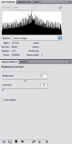
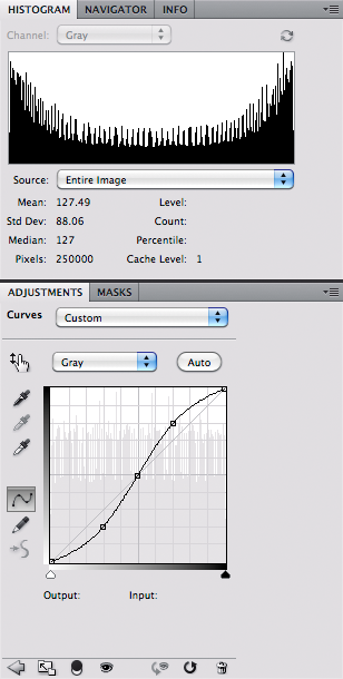
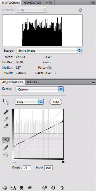
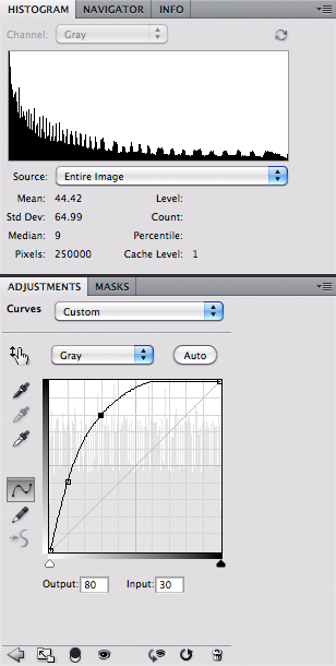
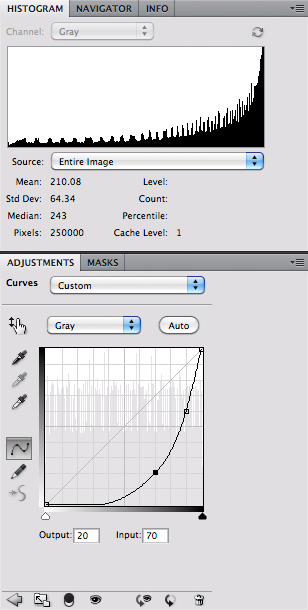
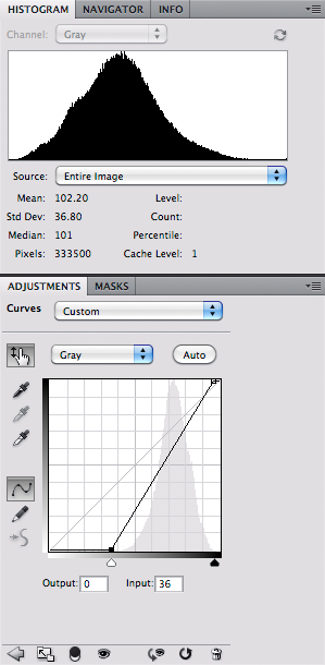
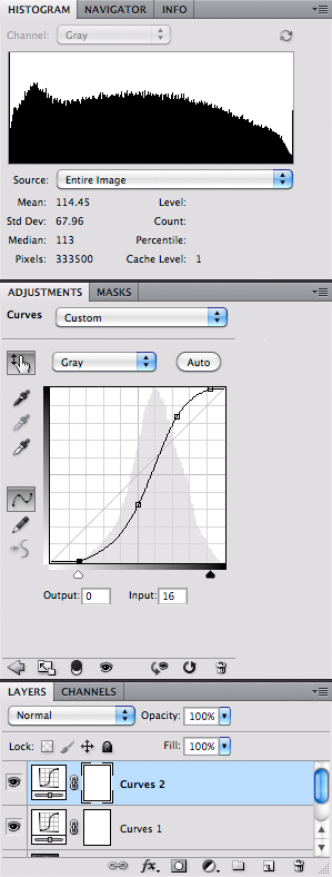
For example, I thought the Curves and the Channel Mixer functions were only used to produce special effects as seen here. Perhaps you can, but that is neither the intent of the tools nor is it their highest and best use.  In the bottom image, I randomly adjusted the sliders in Channel Mixer.

Thanks to Dan Margulis' excellent book, Professional Photoshop, Fifth Edition, I learned a few tricks on the right use of some of the Photoshop tools.  For example, Dan showed how to brighten green foliage using Channel Mixer:


Following are the adjustments:


Searching around the web, I see that most people use the channel mixer as a kind of mysterious saturation or desaturation tool. Above we see how it is used to brighten a color. It is often used as a black and white conversion tool: all you need to do is check the 'Monochrome' box and adjust the sliders until you get the contrast you desire in your conversion.

For a while I've been interested in the Purkinje effect, which describes the shift in colors we experience as light gets dimmer. I was prompted to do this in response the the poor quality of photos I took around dusk: how, I thought, could I reliably and repeatedly correct my photographs to look something like I remember seeing it? My earlier efforts at coming up with a Purkinje correction are here and here.


This correction is a two-step process. First I adjust the relative tonalities of the colors in the scene. When light gets darker, the eye becomes more sensitive to blue-green light, and simultaneously gets less sensitive to red colors. In particular, foliage has a strong red color component in daylight which makes them appear yellow-green; under dim lighting, foliage looks relatively darker. I also noticed that I had to adjust the white balance towards a sky blue color.

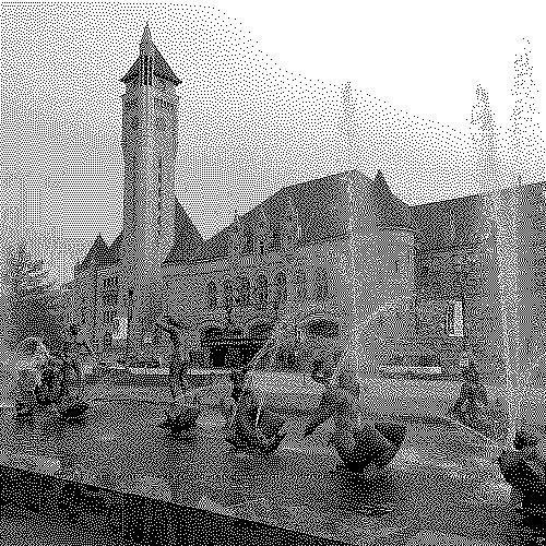
In the scene above, I distinctly recall the foliage being quite dark, while the fountain (seen in the lower right corner), the limestone edging on the sidewalk, and the columns appeared much brighter than the surrounding areas.  In a Luminosity layer, I used the channel mixer to both boost the brightness of the blue channel and to darken the red channel:


I could not just use this channel mixer indiscriminately across the image; the yellow light in the window in the tower was also darkened unrealistically. In this image, I applied the channel mixer with masking so that it did not change the brightest tones in the image.

I got these numbers in the channel mixer by comparing charts of light response of the dark adapted eye versus the sRGB primary color response to light. Measuring the response values across the color spectrum and doing some statistics, I was able to determine which mixture of color components best simulated the eye's night-adapted response.  Here we are getting very close to the intended use of the channel mixer.

The most precise use of the Channel Mixer is for converting between various RGB color spaces. Please consider how I started the article: my old Dimage camera had an odd color space, which if not handled properly, would produce disappointing images and poor color rendition.

Every digital camera has a native color space, and it isn't the Internet standard sRGB or Adobe RGB. Every brand of digital camera has a native color gamut that is whatever. The electronics within the camera do the conversion between the camera's native color space and sRGB; or, if you shoot in RAW, the software on your computer (like Adobe Camera RAW, Lightroom, or Apple Aperture) does it for you after the fact. Digital cameras are sensitive to the various colors in a manner which is quite unlike the human eye's response. Practically speaking, a digital camera is limited by cost, manufacturing technique, and long-term stability; while the human eye is precious beyond cost, has the most complicated manufacturing known, and repairs itself. Therefore it is unrealistic to expect that cameras will see color precisely as is seen by human eyes.

As it turns out, it is very difficult to get precise color capture capability on a digital device, and forget about trying to capture color precisely as the human eye sees it, especially with exceptionally pure colors. (Technically speaking, digital cameras do not meet the Luther-Ives Condition, which determines if a camera can capture colors accurately.) There are cameras that do have better color rendition than consumer or pro-level cameras but a) you can't afford them, b) you don't want to spend the time getting them to work right, c) these cameras only work in controlled laboratory conditions, and d) you won't be able to display your accurate colors on a computer monitor or print them on a printer. So we are looking for good enough colors.

So we take a digital camera that has a color space of whatever, and we use the computer to convert the images to a standard color space like sRGB.  Here is an example photo taken with my Nikon D40. I shot this X-Rite ColorChecker Passport in daylight using RAW capture. I set the white balance using the neutral card in the bottom photo.  Here I used Nikon View NX2 software to convert the RAW image to JPEG in the sRGB color space:


I held up the target in daylight coming through my office window, and compared it to this image on my screen.  The colors look pretty accurate. But this is not the image as the camera captures it. There is some significant processing going on to produce this final image.  Here is an approximation of how the camera really sees the target:


I used the free and excellent RAW Photo Processor for Mac OS X. I set the white balance to UniWB, set the gamma to 1.0, and saved the image as raw pixels without a color profile loaded.  By looking at this image we can see that the camera is very sensitive to green light, less sensitive to blue, and not very sensitive to red light. All cameras have a fixed, native white balance which does not correspond to any common lighting condition. Because digital cameras capture more than 8 bits per channel — usually in the range of 10 to 14 bits per channel — these extra bits are used to prevent banding artifacts when the software does this kind of processing.  For daylight, the camera must amplify the blue channel by about 50% and approximately doubles the signal in the red channel. Under incandescent lighting, the red and green channels are usually fine, but the blue channel must be boosted strongly, which typically causes lots of noise.

Let's do a white balance.  I used RAW Photo Processor to apply the white balance which I captured when I took the photo:


Cameras don't see light like humans do. In a camera, twice the light intensity generates twice the RAW signal; with humans, doubling the intensity of light makes a scene look only somewhat brighter. Likewise, halving the intensity of light only makes a thing look slightly darker. And so digital images are designed to provide extra sensitivity to the darker tones at the expense of brighter tones; this will allow us to more efficiently use our image data by allocating more data to the important midtones. To correct for this, we have to brighten the midtones in the camera's image, while keeping the very darkest and brightest tones unchanged.

Here I applied a brightness (or gamma) correction in RAW Photo Processor. This is not the precisely same brightness curve as is found in the sRGB standard, so the tonality of this image doesn't quite match the Nikon-processed image. But it is good enough for our purposes.


The first thing I notice is that the colors are disappointing. They look a bit flat and unsaturated compared to the first image. But this is actually a good thing. It tells me that my camera's native color space — whatever it is — is broader than the sRGB color standard. This flatness tells me that the colors could be potentially much brighter, if only I use a large enough color space, one larger than sRGB. In the camera native color space, the bright red color on our X-Rite target is merely mediocre.

To do this conversion from the camera native color space to sRGB in Photoshop, we imitate the processing used by the camera manufacturers by using Channel Mixer.

Suppose you take a given standard color, and take a photograph of it, being careful to do a good white balance and exposure. Good standard colors ought to produce a particular sRGB color value if exposed correctly; for example, a pure red the same color as the sRGB primary red color ought to give you R=255, G=0, B=0. But since your digital camera uses a different color system, it gives you another value, such as R=200, G=58, B=27. Your digital camera likely has a primary red color that is brighter, more saturated, and more pure than what the sRGB standard can describe.

So what we do is to boost the camera's red value somewhat, and then subtract out any green or blue that happens to be contaminating the red. So for any given Camera RAW value, we can get the equivalent sRGB values.

I got test data from DxOMark, a company that measures performance data for digital cameras and lenses. Here is an excerpt from the dataset:


Go to http://www.dxomark.com/index.php/Camera-Sensor/All-tested-sensors/Nikon/D40, click on Color Response, and click CIE-D50. This gives you daylight color data. They also provide CIE-A data, which models incandescent lighting.

Please note the White balance scales: this shows how much we should boost the various RAW color channels to get good white balance under D50 daylight conditions. Please note that D50 is much bluer than midday sunlight at mid-lattitudes, but is a good enough approximation for our use here.

To convert the RAW data to sRGB, we put the DxOMark Color matrix data above into the Channel Mixer:


Please note that due to rounding errors, the numbers in each Output Channel do not total to 100%. Undoubtably this will shift our white balance slightly.  Generally speaking, be sure that each channel mixer output channel totals to 100% to avoid a change in white balance. However, the final image looks pretty good:


The colors are fairly close to the Nikon-produced colors.

You can use the same sort of process to do your own camera calibrations under all kinds of lighting conditions. Please note that the DxOMark color matrix data assumes the use of something like the channel mixer to convert from the camera's native color space to sRGB. For example:

sRGB Red = (1.64 x Camera RAW Red) - (0.61 x Camera RAW Green) - (0.02 x Camera RAW Blue)

If you have a target with known sRGB (or other color space) values, you can convert an image to these colors by comparing the delivered colors with the known colors. I use Microsoft Excel to come up with estimates for the channel mixer values, using the Solver tool found in the Analysis ToolPak add-in. This is a rather complicated step, and requires some knowledge of statistics.

Please note that this mathematical transformation between color spaces is not exact, but is rather statistical in nature; the conversion matrix merely gives good color conversions on average. A severe channel mixer setting will also cause much more noise in your image.